福鼎白茶 | 品牌三折頁設計
Brand Tri-fold Brochure Design

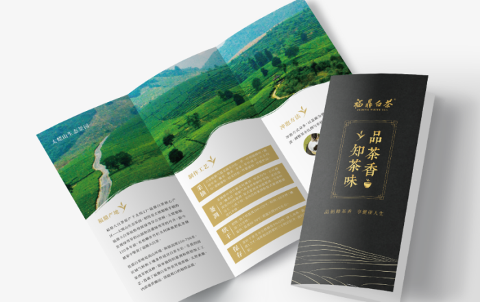
此作品為傳統產業品牌的三折頁概念提案。
原品牌視覺以紅底白字為主,整體較偏向傳統與功能導向,因此在此次設計中,希望透過視覺重塑提升品牌文化感與整體質感。
配色上改以黑色為主體,搭配燙金元素,營造更沈穩且高級的品牌氛圍,並透過簡約線條與留白設計,讓資訊呈現更加俐落有層次。
此次設計希望在保留產業原有信任感的同時,也能展現品牌轉型後更現代化的形象。
This project is a concept proposal for a tri-fold brochure redesign for a traditional industry brand.
The original visual identity mainly used a red-and-white color scheme,
with a more conventional and functional appearance.
The redesign aimed to elevate the brand image by creating a stronger sense of culture,
refinement, and premium quality.
The new design adopts a black-and-gold palette to create a sophisticated and elegant atmosphere.
Minimal line elements and generous spacing were also incorporated to improve
Minimal line elements and generous spacing were also incorporated to improve
visual hierarchy and present information in a cleaner, more modern way.
The goal of this project was to preserve the brand’s sense of trust
while introducing a more contemporary and refined identity.
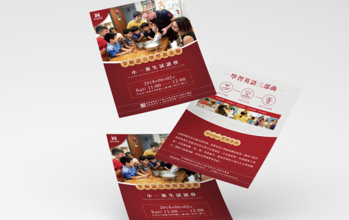
The goal is to help students see language not only as a subject, but as a tool for understanding everyday life and exploring the world.
The visual design uses a lively yet balanced layout style to create a brand image that feels both educational and approachable.