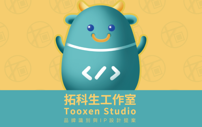
拓科生 | 品牌識別與IP設計
Brand Identity & IP Design


此案為協助朋友工作室進行的品牌視覺重塑專案,除了原有的科技與數位服務形象之外,
也希望透過更具親和力的視覺語言,建立年輕化且具有記憶點的品牌印象。
拓科生是一間專注於 UI/UX 設計、網站建置與 APP 開發的數位團隊,擁有電子商務、技術顧問與品牌設計等跨領域實務經驗。
在品牌方向上,希望打破大眾對科技產業過於冰冷與距離感的既定印象,
因此整體視覺以「Light Tech」作為核心概念,結合柔和色彩、圓角幾何與角色化設計,打造兼具科技感與溫度的品牌形象。
IP 角色則以品牌名稱中的「ox」作為發想,將牛的穩定、可靠與長期陪伴特質,轉化成具有科技感的品牌夥伴。
除了主角色之外,也延伸設計不同定位的小夥伴角色,象徵團隊合作、專案整合與創意執行等多元職能。
在專案討論過程中,讓我印象深刻的是,朋友提到自己因工作需求經常需要出差,因此希望能設計一組角色貼紙,作為貼在行李箱上的專屬識別。
也因為這個想法,後續在提案展示中加入了行李箱與旅行物件的情境應用 mockup,讓角色不只是存在於數位畫面中,也能自然融入品牌的日常使用情境。
整體視覺方向希望呈現一種更輕盈、更貼近年輕世代的科技品牌氛圍,讓品牌在維持專業性的同時,也能保有溫度與人格感。
This project is a visual identity redesign created for a friend’s digital studio,
aiming to build a more approachable and memorable brand image through mascot development and a refreshed visual system.
Tooxen is a technology-focused team specializing in UI/UX design, website development, and mobile application solutions,
with experience across e-commerce, technical consulting, and branding services.
Rather than following the conventional cold and rigid aesthetic often associated with tech companies, the visual direction was developed around the concept of “Light Tech” — combining soft color palettes, rounded geometric elements, and character-driven branding to create a warmer and more youthful identity.
The mascot concept was inspired by the “ox” element within the brand name.
Traits such as reliability, stability, and long-term support were translated into a futuristic yet friendly character design.
Alongside the main mascot, additional companion characters were created to represent different team roles, symbolizing collaboration between project management, creative design, and technical development.
One memorable detail during the project discussion was when my friend mentioned that he frequently travels for work and hoped to create mascot stickers that could be placed on his suitcase as a recognizable travel identity.
Because of this idea, I incorporated luggage and travel-related mockups into the final presentation,
allowing the mascot system to feel more connected to real-life applications rather than existing solely within digital screens.
The overall visual direction focuses on creating a softer and more human-centered technology brand experience — balancing professionalism with warmth, personality,and approachability.